It’s getting close to fright night! And here at Pumpkin Web Design Manchester, we are totally in the spirit. So we thought we’d bring you a guide to all the things that frighten us the most, with our guide to the top 4 “horrifying” web design mistakes.
4 “horrifying” web design mistakes
Web design mistakes don’t just look bad, they scare away your customers too. Not to mention the search engines. Which is why it’s so important to get the right balance for your website. And this includes planning to meet the needs of your users, with quality user experience techniques. But some websites fall short, with obvious design mistakes, including:
- Creepy crawly text
- Terrifying colour schemes
- Intimidating images
- Withering white space
Creepy crawly text
Typography on a website is key to success. After all, it’s your written content that helps users understand what your website, and your company is all about. And what you stand for. So if you use spidery typography that simply can’t be read, or is very difficult to read, you can be sure that potential customers simply won’t bother. They’ll go elsewhere. And this means you could miss out on sales and sign ups.
But it’s not just the font type you choose, it’s also the style and design of the text. This includes the size of the letters, the spacing of the gaps between words, sentences and paragraphs, and the spacing around the text. It’s important to make each word, and even each letter, obvious and clear to read.
Terrifying colour schemes
Colour is one of the most important features of any website. It should relate to your company branding, especially if you have a real world shop or presence. But it should also help to guide users around your website. And while this is less helpful for colour blind users, it can still be an effective way to help layout and navigation. But unfortunately, some websites choose colours, and colour combinations that are frightful. And this in turn causes potential customers to leave the website, without making a purchase.
To put this right, or prevent this, you should try and stick to only three colours on your website. Seriously, it doesn’t need to be a rainbow. And always remember to tone it down a bit.
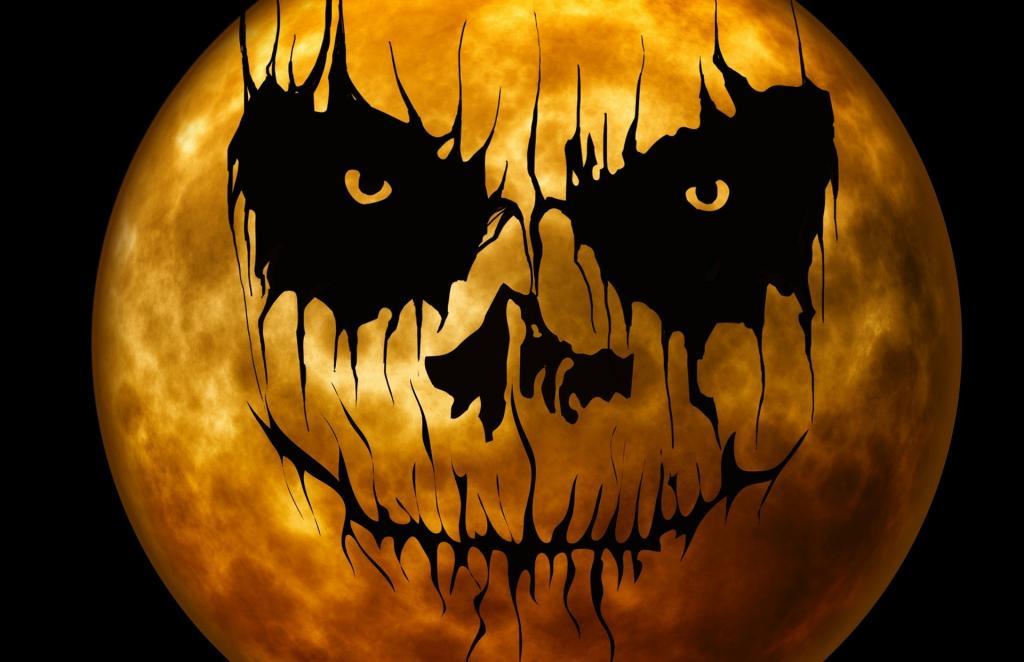
Intimidating images
Imagery and visuals on a website are the first thing that a potential customer will be drawn to. In fact, they might even scan your home page, only looking at the images. So if your images are all cheesy stock photos, not only could customers find these intimidating, but they also don’t appear genuine. And there is nothing more scary to consumers, than a company that doesn’t look genuine. This isn’t a good look. And it can dramatically influence the sales and sign ups you make. So, always use original, and professional imagery for the best results.
Withering white space
In addition, too many websites forget to use whitespace effectively. The space around elements can be so useful for directing attention inwards, and spacing elements apart. And this is too powerful to forget about, so don’t let it wither away. In fact, it’s probably one of the most “horrifying” web design mistakes.
To keep your website free from frightening disasters, get in touch with the professionals today, here at Pumpkin Web Design Manchester. From Southport to Wigan, we deliver high quality web design solutions for businesses, companies and individuals.