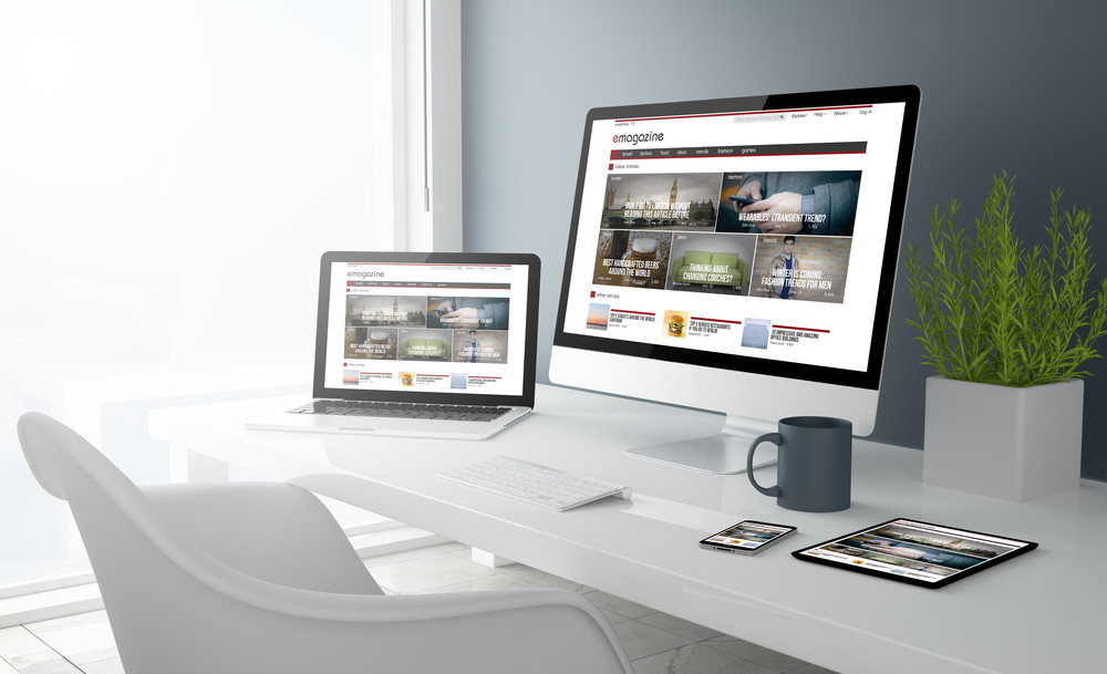
Here at Pumpkin Web Design Manchester, we are Manchester’s leading web design specialists. And we work with companies and business around the North West and across the region, from Southport to Wigan, to deliver high quality web design solutions, that really get results. We put a lot of time and detail into our web design. From the big and flashy above the fold content, to the tiny icons and details that can make all the difference. But not every web designer is so careful. In fact, we have produced this list of the most common web design mistakes.
The most common web design mistakes
Web design mistakes that pop up time and time again are far more numerous than you would expect. And these mistakes include:
- Unsuitable colour schemes- too many websites fail to pay attention to the colour palette they are using. With too many colours, or clashing colours, you could be driving away your audience, instead of welcoming them in. Colours used inappropriately can be distracting. So keep your website visitors attention with a good colour scheme. And remember to stick to the rule of three, when choosing a colour scheme.
- Unsuitable imagery- your products or services are only as good as the images you use. At least in the digital world anyway. After all, the images of your products are all that potential customers can use to make a judgement about what you have to offer. So make sure you always choose high quality, professional imagery to showcase your company in the best light possible. This can even help you increase sales.
- Neglecting the above the fold content- your above the fold content is the content that users will see when your website loads, before they scroll down. As a result, this is probably one of the key, most important, areas of your landing page or website. And it is the piece of content most responsible for drawing attention to your website, and encouraging users to delve deeper. As a result, you should always pay close attention to this part of your website, and use professional imagery, typography or even video content to make your above the fold content work for you.
- Unsuitable typography- using typography on your website is a great way to draw attention to pieces of text, and headings and titles. However, it is important to choose a sensible type of typography, that will be easy to read. Too any swirls, twirls of flourishes can make your font difficult to read. And this will simply put users off. Which means you could lose out on sales. As a result, you should stick to fonts that are easy to read, and use sensible spacing to ensure that your typography can be read easily, on any screen size.
- Too many font types- Using different font types for your headings and content is common practice. And it usually works really well. But introducing more than two font types to your web page can make it hard to read, and visually confusing. It’s generally not a good idea.
For more information or advice, get in touch with the experts today, here at Pumpkin Web Design Manchester.

