Showing your audience everything you can offer, and answering their potential questions is a great aim for any company looking to get ahead online. However, just because you have a lot to show, doesn’t mean you should show it all at once. Filling up your home page won’t help your users find what they need, and it wont give you the necessary space to really highlight what you can offer. Instead, it causes visual confusion and leads to a higher bounce rate. So, you need to reduce the amount of information, or visual clutter. Here at Pumpkin Web Design Manchester, we are Manchester’s leading web design professionals. And we know how important it is to present the perfect image online. As a result, we have produced this guide to reducing visual clutter in web design.
Reducing visual clutter in web design
Whether it’s your intended landing page, or your services page, website visitors can land on any of these first and foremost. So it’s a good idea to minimalise your whole website, not just the landing pages. Here are some top tips to help you remove anything unnecessary from your web design:
- Choose your priority- the call to action button on each page should be the central focus for many company websites. And with this in mind, it needs to be the most visual point on your website. The element that stands out from the rest. To really make this work, you will need to increase the whitespace around the point, and remove any other links, buttons or images that could cause a distraction.
- Stick to a minimal colour palette– colours are great. But too many colours in web design is a headache waiting to happen. Even if your colours blend well together, too many colours can be distracting, and chaotic, as they direct users eyes to various parts of the page. Even away from the main focus itself. Instead, choose a background colour that is bland, either pale or dark, and use a bright colour to add visual interest, but only to key features.
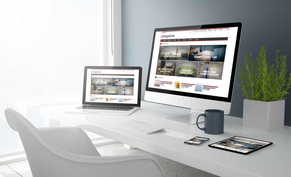
- Make 80% of each page visual- the 80/20 rule determines that 80% of your web content should be visual. So, make sure that what each user sees, on any device, at any point of the website, is 80% image based. This makes your website easier to process, easier to judge, and most importantly, easier to connect to.
- Choose plain typography- embellished typography with swirls and twirls is likely to go against the idea of minimal. In fact, this kind of typography increase the cognitive load, and the visual weight of a website. Which can be visually distracting for users.
- Keep navigation simple- whether you go for a static horizontal or vertical menu, or a hamburger menu, keep the presentation simple and straightforward. This will help users effectively navigate your website with ease, and improve the user experience. It will also help to make sure that your website is simple and stylish, without being visually cluttered.
For more information or advice, get in touch with the experts today, here at Pumpkin Web Design Manchester.