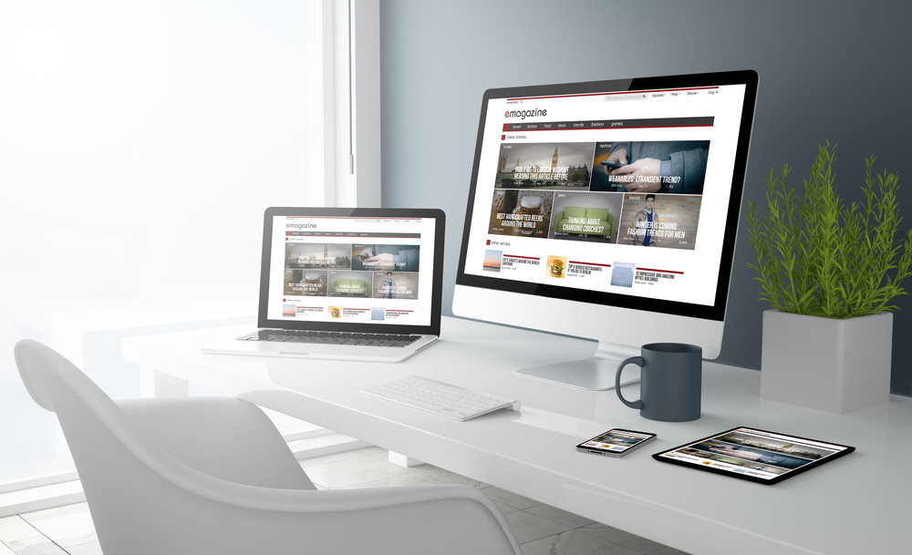
Designing a website that can grab the attention of a potential customer, and then persuade them to trust in your company, make a purchase or sign up, is not an easy task. From the layout and colour scheme, to the typography and imagery, there are a lot of considerations to be made. But these aren’t only design and style decisions, they also need to be practical too. Your website users expect your links to load, your website to be fast, and your content to be useful and legible. This means that choosing navigation options, and design styles, can be complicated. One popular combination is the use of minimalist web design, complemented by a hamburger menu. But is this effective? And why do these two features work well together? Well, here at Pumpkin Web Design Manchester, we are Manchester’s leading web design professionals. From Wigan to Southport, we work with companies across Manchester and the surrounding region to deliver high quality web design solutions that really get results. As a result, we have produced this guide to the hamburger menu and minimalist web design.
What is minimalist web design?
Minimalist web design is a design trend that involves removing anything unnecessary from the screen. This leaves only the absolutely key features, and allows users to really focus on any imagery, or text, on the screen, at any one time. Reducing visual distractions can actually ensure that your customers have a better user experience, and as a result, you could see an increase in profits.
What is a hamburger menu?
A hamburger menu is a type of navigation system that hides the links to other pages, behind an icon. The icon usually has three lines, stacked on top of one another. This is a well known symbol, used throughout mobile devices and apps, as well as on a wide range of websites, so your users will automatically recognize it as a type of menu.
The hamburger menu and minimalist web design
So, why does the hamburger menu complement minimalist web design? And why are the two often combined together? Well, there are a number of reasons, including:
- The hamburger menu hides the navigation bar- minimalist design is often also very visual. And if you have an above the fold poster image, and then a navigation bar going through it, this detracts from the image itself, taking away attention from the point you are trying to make. Hiding the navigation options instead, behind a small icon, is a great way to keep clutter off the screen, so users can focus on one page at a time.
- The menu options can be minimalistic- once users click on the hamburger menu, a list of navigation options will be revealed. This can be designed in way that sticks to minimalist design principles, so that once opened, your navigation bar still fits in with the rest of the website design.
For more information or advice, or for high quality, professional web design solutions, get in touch with the experts today, here at Pumpkin Web Design Manchester.