
Effective web design is all about user experience, usability, and style. Balancing these elements will inevitably lead to stunning web design solutions that can really draw in your users, and make a statement about your company. But styles are constantly changing. Especially online, where what was popular three months ago, could have completely changed from what we see now. And that is something we have seen with the rise in dark background colours. Once shunned by the industry, an increasing number of designers and companies are opting for bold and dark backgrounds. Here at Pumpkin Web Design Manchester, we are Manchester’s leading web design experts. And we work with companies and businesses across Manchester, and the surrounding region, including Southport and Wigan, to produce high quality, effective, web design solutions. As a result, we have produced this guide to how to use dark backgrounds in web design.
Dark backgrounds in web design
Dark colours have been avoided in web design for a number of years. Instead designers have favoured pale, light colours, or even just simple white. This is because the light colours symbolize a blank canvas. Or a story that’s yet to unfold. And this allows users to feel in control of their online experience, creating their own story. In fact, users now almost expect to find a white background when they open a new website. And this leads to a feeling of familiarity.
Dark colours on the other hand can be more emotive, intriguing and interesting. Which means that a dark background can draw a user into the web page, without this feeling of familiarity. And this can actually increase sales and sign ups, as users are less likely to over analyse on a website that takes them slightly out of their subliminal comfort zone.
How to use dark backgrounds in web design
So do dark backgrounds work well on any website? With any design choices? Or should you choose carefully when using a dark green, blue, purple or even black background. Well, simply put, dark backgrounds are not as pliable and easy to mould as white backgrounds. You will need to pay close attention to:
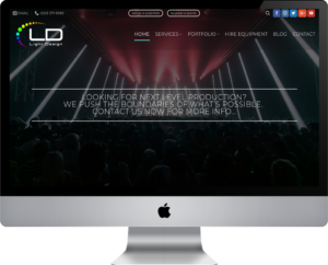
- the text- one of the biggest disadvantages of a dark background is the readability of the text. So you will need to make sure your text stands out, and contrasts with the background, to make it easier to read. You might also want to make it twice as big as it would be on a white background, to really help with the readability of the content
- whitespace- by this we mean the negative space on the page. The space that isn’t being actively used. On a black background, the space on the screen feels much smaller. And this means that you will need to increase the amount of negative space around elements, to really draw attention to them. Focusing on one element at a time is also a good idea, with no columns of blocks to confuse the layout.
For more information or professional web design support, get in touch with the team today, here at Pumpkin Web Design Manchester.