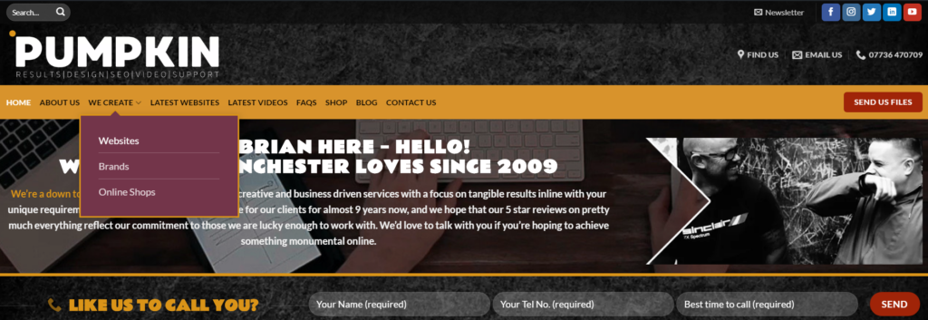
Navigating any website should be quick, simple and painless. Unfortunately, this is not always the case. If your website has a large number of pages, and these are not categorized properly, your users could be wasting a lot of time trying to reach the page they want. And simply put, the more time they spend looking, the less likely they are to remain on your website. As a result, website navigation can be one of the most important aspects of web design and functionality, from the point of view of the user. And it is something many small businesses often overlook. Here at Pumpkin Web Design in Manchester, we are Manchester’s leading web design experts. As a result, we have produced this guide to web design and navigation best practices.
To subpage or not to subpage…
One of the first things to consider when planning your website navigation is whether or not to use subpages. Subpages are listed below the standard website pages and this is why it it essential to categorise your pages into subjects. For example, product pages or service pages will be different from one another, and listed in separate categories. While some websites will need all their pages to be linked to the navigation bar as subpages, others will choose not to link these pages at all. Instead using links to the subpages from the parent page itself.

While there is no right or wrong way to use subpages, or not, inconsistency can cause your users to become confused. For example, using some subpages, but not others, will lead you users to feel that there are no subpages for other pages. And this can cause you to miss out on sales and custom. So whether or not you use subpages, be consistent.
Navigation bar
Again, there are different opinions about the role of a navigation bar. Should you use a full navigation bar, or hide your navigation bar behind a hamburger icon, or a menu list? Either option can be a great choice for your web design and it will depend on your overall design aim. For minimalist design, a navigation bar can be off-putting and take up too much room. While for other forms of web design, it can be an essential element defining page boundaries.
In addition, the navigation bar itself should change depending on the screen size of the user accessing your website. Responsive design will include creating a navigation bar that is accessible on all screen sizes. This is why most of the websites you view on a mobile will use a hamburger menu to hide their navigation. It simply takes up less room, and is much easier to use on a small screen.
Limit the number of clicks
The interaction cost of your website is a common user concern. Time is precious, and your users do not want to waste it clicking through various drop down lists to find the page they need. In fact, this is not very user friendly at all. For this reason, you should aim to allow your users to reach any page on your website within one to three clicks. Any more than that and the interaction cost is simply too much to ask. And your conversions and sales will fall.
However, you don’t want to offer users too much choice on one page. So using subpages is a good idea to organise your content. But anymore than two levels, and your content is simply buried.
For more information about web design and navigation, get in touch with the experts today, here at Pumpkin Web Design Manchester. Manchester’s leading web design experts.

